Product Listing Page Optimization: Best Practices for Improving Conversion Rates
Reading time: 10-12 minutesIn e-commerce websites, successful shopping experiences begin with how users discover and select products. For many consumers, the purchasing journey doesn’t start with searching for a specific item but rather by browsing to explore products that might interest them. Therefore, product display pathways in e-commerce sites—especially category pages and product listing pages—play a crucial role in guiding user decisions.Through systematic optimization of listing page layouts, filtering capabilities, sorting logic, and visual presentation, you can enhance user browsing efficiency, shorten purchase decision time, and ultimately improve conversion rates.
Core Functions of Product Listing Pages
Product Listing Pages (PLPs) serve as bridges connecting user needs with specific products. When users enter a product category through the homepage or main navigation, listing pages are the first substantive pages they encounter. Their design must clearly display all options within a product group while helping users quickly filter, compare, and find items that best meet their needs.For users entering a site through external search engines like Google, listing pages are often their first destination. Research shows that when users search for product types (like “men’s running shoes” or “wireless earbuds”) rather than specific models, they’re more likely to be directed to category or listing pages instead of individual Product Detail Pages (PDPs). This means optimizing listing pages is crucial not only for internal navigation but also directly impacts search engine optimization (SEO) and traffic conversion.
Key Elements and Points for Product Listing Page Optimization
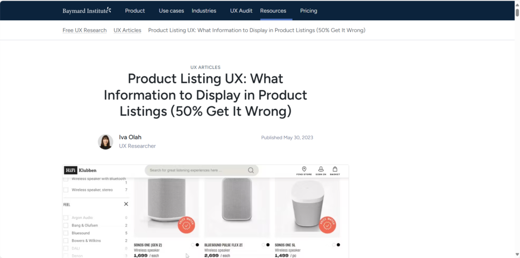
A well-designed Product Listing Page (PLP) is one of the most important elements in the e-commerce conversion funnel. According to Baymard Institute data, optimized PLPs can increase conversion rates by up to 35%. Here are 8 core elements necessary for building effective PLPs:
1. Optimize Titles and Banner Designs
Titles and banners are core visual guides on the page, directly affecting users’ first impressions and content accessibility. Ensure they accurately convey the page theme and help visitors quickly locate target information.Brand Reinforcement: Utilize top space to create visually attractive, information-clear banners that balance aesthetics with functionality. SEO Optimization: Embed keywords in <h1> tags to enhance content identifiability and improve search rankings. Simplicity Principle: Avoid information overload, keeping designs clean and crisp.Optimization tips:
- Add subheadings to highlight themes
- Break long sentences into short points using “category + key attributes” structure (e.g., “iPhone 15 Pro Max 256GB – Space Gray”)
- Emphasize both user experience (UX) and SEO value
- Use action-oriented phrasing
- Remove redundant expressions, increase information density, keep within 50-60 characters to ensure complete display in search results
- Add structured formatting to improve readability
2. Try Multiple Layouts for Product Listings
The display format of product listings (list view vs. grid view) directly affects customer browsing habits and purchase decisions. Choosing which layout doesn’t have a fixed answer but depends on product type and target user experience.List View: Information Priority, Convenient for In-depth Comparison✅ Suitable scenarios:
- Need to display detailed specifications (size, features, parameters)
- Customers need to compare key attributes of similar products (electronics, appliances, tools)
- Suitable for high-ticket or high-decision-cost products, allowing users to research carefully
📌 Advantages:
- Provides more textual information, reducing the need to jump to detail pages
- Ideal for technical or complex products, helping customers make rational decisions
- Can be paired with filtering and sorting functions to improve search efficiency
Grid View: Visual Priority, Improving Browsing Efficiency✅ Suitable scenarios:
- Products relying on visual appeal (clothing, home goods, gifts)
- Products requiring minimal text descriptions, where images convey core selling points
- When encouraging quick browsing and impulse purchases (promotional items)
📌 Advantages:
- Reduces scrolling, displaying more products on one screen
- Enhances visual impact, suitable for image-driven categories
- Can be combined with labels (such as “bestseller” or “new arrival”) to attract clicks
3. Add Product Suggestions
If someone is already browsing your product listing page, they likely have purchase intent. This is the perfect time to make suggestions and cross-sell or upsell your products:Some customers experience decision fatigue when faced with too many choices. Gently recommend popular products, other products in the same category with similar tags, or similar (but slightly higher-priced) alternatives.Suggest products that might be related to what customers are viewing with “People who bought this also bought…” For example, customers interested in tech products might appreciate matching accessories.Display seasonal bestsellers to increase specificity and relevance, leading to more clicks and conversions. We tend to believe that what others do is correct, so if a product is labeled as “popular,” it gains additional legitimacy, encouraging customers to make decisions.
4. Personalize the Shopping Experience
Personalization can significantly increase conversion rates, enhance engagement, and categorize products based on personal preferences, helping shoppers discover relevant products. Personalization can also reduce bounce rates by 20-30% and improve customer loyalty.To provide visitors with personalized experiences, one thing you can do is show complementary products they might be interested in. For example, customers buying new bed sheets might also be interested in pillowcases or sleep caps, so you can guide them in that direction.
5. Implement Intuitive Navigation
Navigation must be tailored to help potential customers find what they want as easily as possible and with minimal hassle. You can try some tips and tricks, including:
- Place bestselling products in the most visible positions
- Social proof information: Customers like knowing what others are buying. The most popular products are often viewed as the safest choices. Adding elements like user ratings can really drive this point home.
- Website speed is a key factor in user experience (UX): Ensure your site loads quickly on both desktop and mobile devices to guarantee customers have a pleasant experience.
- Keep the navigation bar fixed at the top of the page and organize products in a logical manner.
Regardless of page depth, navigation always plays a crucial role in user experience—product listing pages are no exception. Since some products have complex specifications requiring extensive sorting options, pay attention to website performance when sorting products and helping customers find their ideal items.
6. Optimize Product Listing Pages for SEO
For most e-commerce players, SEO is a big deal. In fact, according to a study conducted by SmartInsights in 2023, search engine traffic accounts for approximately 50% of all e-commerce traffic.There are two main reasons why product listing pages dominate in terms of SEO:A. Product listing pages are rich in keywordsCategory pages tend to be keyword-rich due to containing product names, brands, prices, specifications, and descriptions. This means they naturally rank for numerous keywords in search engines.B. Product listing pages have the strongest links with following pagesProduct listing pages are typically where you want customers to start their journey (or on the product pages themselves), which is why SEO specialists tend to focus their energy on these pages. Additionally, all products in a category usually link back to that category, creating a powerful internal link-building pattern.Optimization points for product listing page SEO:
- Optimize your title tags
- Use unique, original product and meta descriptions
- Link to internal pages
- Use image alt attributes and rich snippets
7. Test Components Like “Quick View”
Quick view is a mini-product page, usually embedded with a direct “Add to Cart” button.Not all products require long consideration before purchase, and quick view functionality allows customers to delve into product descriptions, select options, and put items in their cart—without leaving navigation. This is especially useful for returning customers or those buying fast-moving consumer goods like groceries. Creating add-to-cart buttons can streamline the checkout process. You can also implement add-to-wishlist buttons for more complex or expensive items, providing a shortcut for shoppers who value quick and efficient shopping experiences.
8. Utilize Hover Functionality
Images are powerful tools in product presentation. Introducing hover functionality, providing alternative views or magnified details, allows customers to get close to products without leaving the product listing page. This small change could be key to improving conversion rates.
8 Brand Examples with Effective Product Listing Pages
Allbirds
Allbirds uses horizontal side-scrolling in their product listing page design to make shopping easier. When optimizing product listing page user experience, consider the role of color in purchase intent. The option to toggle variants makes viewing related products easier—horizontal scrolling also saves space.Tip 💡 Highlight limited-edition colors to enhance uniqueness—rare colors are favored by more customers.
Natori
Natori creates personalized product listing pages by displaying dynamic content that arranges similar products in the same row—it can be based on color, collection, or even browsing history.Tip 💡 Mark related products with appropriate descriptions so users know exactly what they’re looking at even if images look very similar.
Everlane
Everlane’s product listing page places special emphasis on presentation—here are a few things they do right:✔ Background color—though slightly different, the different photo backgrounds don’t bore shoppers browsing more content✔ Visual change on hover—while each image changes on hover, the experience doesn’t feel disruptiveTip 💡 For products requiring technical parameters and information, list view (1 product per row) is recommended. Grid view (2 to 4 images per row) is suitable for products focused on visual appeal (like fashion, cosmetics).
ULTA
ULTA demonstrates that PLP headlines must be persuasive—they make them visually appealing and include enough information to entice visitors to product pages.Tip 💡 Using a dynamic search bar in the first screen can make it easier for users to discover products on product listing pages.
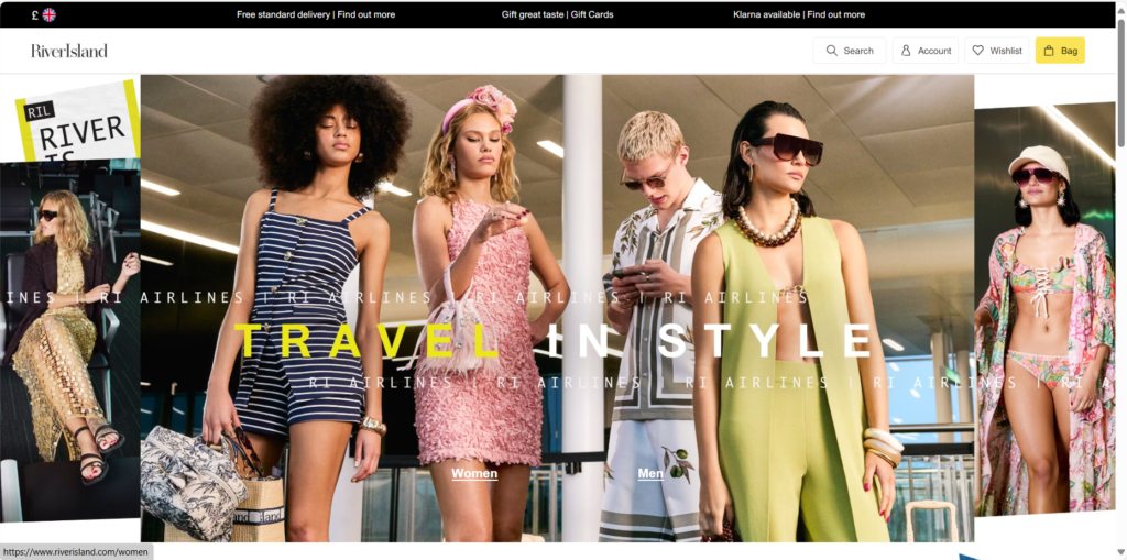
River Island
River Island makes full use of product recommendations—product suggestions with the right context can increase your AOV, such as displaying product recommendations based on past browsing behavior.Tip 💡FOMO tags like inventory alerts can also be added to product listing pages to convey scarcity.
The Beauty Chef
The Beauty Chef makes product listing page designs conversion-oriented by emphasizing products offering subscriptions—if only add-to-cart buttons are provided, those wanting to subscribe and save won’t consider purchasing.Beauty Chef positions “Subscribe & Save” as a secondary CTA, helping shoppers understand how much they can save compared to one-time purchases on product pages.Tip 💡 Include subscription discount percentages as part of the CTA microtext—this will provide a product listing template where shoppers don’t need to linger on product pages.
Huel
Huel’s product listing page shows how product labels can highlight benefits that immediately address main customer objections, which is exactly what this nutrition brand does on its product listing template.Tip 💡 Place labels in the upper right corner of images for improved readability.
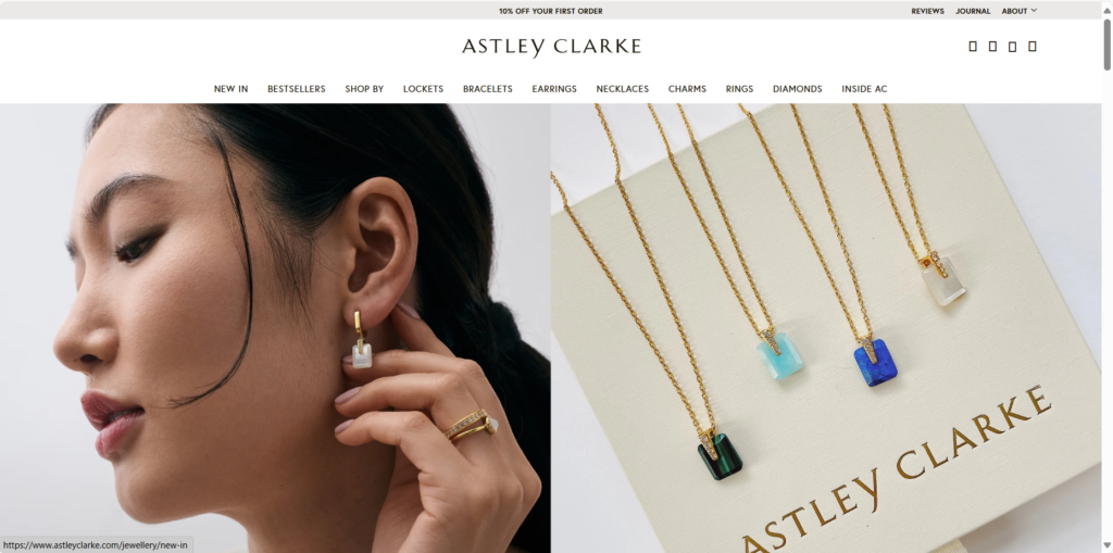
Astley Clarke
Astley Clarke demonstrates how e-commerce brands that rely more on reciprocal marketing tend to achieve better conversions over time. They add prompts like “Free Little Box Personalization” on product listing pages filled with customizable jewelry.Tip 💡 If there isn’t enough budget to offer free personalization for every purchase, BOGO or BTGO offers might be more suitable.
Conclusion
In the shopping process of e-commerce websites, Product Listing Pages (PLPs) play a critical transitional role, serving both as transfer stations for users navigating from categories to specific products and as important landing pages for search engine traffic. However, many platforms still have notable shortcomings in their product listing page designs, directly affecting user experience and conversion efficiency. This is specifically manifested in four aspects:
- Information overload: Too many products or complex filtering options may confuse users.
- Lack of personalization: Static sorting and display methods cannot adapt to different user preferences.
- Poor mobile experience: On small screens, filtering and browsing efficiency may significantly decrease.
- SEO potential not fully exploited: Keyword layout and content structure of listing pages may not be optimized for search engines.
One key factor in transforming temporary visitors into enthusiastic customers is: irresistible product listing pages. Through these optimization strategies, you can enhance user experience and prompt customers to take action:
- Optimize titles and banner designs to be concise, clear, and SEO-compliant
- Use appropriate layouts to display products
- Add suggestion modules to assist user decision-making
- Personalize shopping experiences to help users discover products
- Use intuitive navigation to organize products logically
- Optimize SEO to increase organic traffic
- Leverage features like “quick view” and hover magnification to enhance product presentation